Visibility icon added to document viewer
It’s not completely clear to agents that they need to actively share or share back their current version of a document with the other party for others to see the most recent changes. Furthermore, the shared status of the most recent version of a document isn’t readily apparent in-app. To help make this more apparent to a user and facilitate the completion of transactions, we’ve added a visibility icon to the document view. This icon tells the agent 1) who currently has access to the current version of the document, and 2) what actions—if any—they need to take. There are three statuses for this icon, each with corresponding modals.
If a form hasn’t been shared with anyone, the icon will read “Private”:
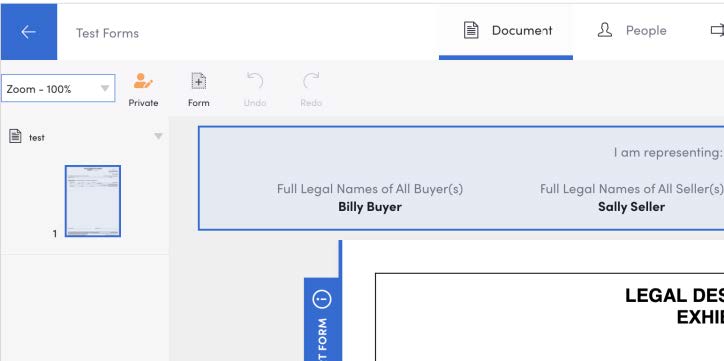
Clicking the icon will bring up this modal explaining what the status means, along with a call to action:
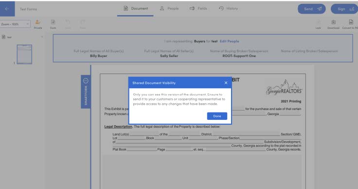
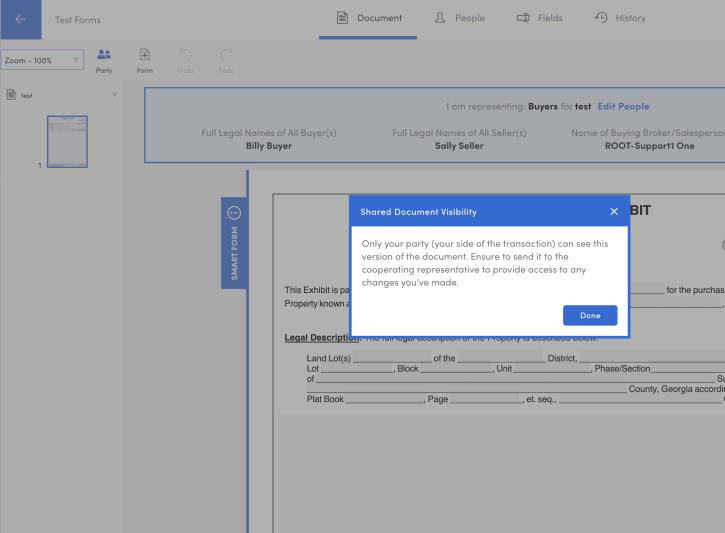
If they’ve only shared the document with their client, the icon will read “Party”:

The accompanying modal explains this, as well as a further call to action:
When the current version has been shared to the other party in the transaction, the icon will read “Everyone”:
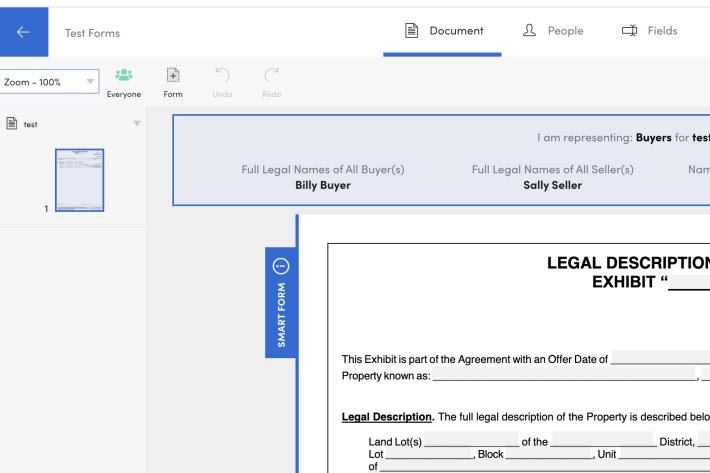
The modal explains the status further:
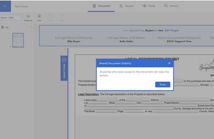
When the agent on the other side of the transaction makes an edit, the app effectively creates a counter offer (or new version of the document) with the needed signatures wiped. The action also reverts the visibility for that agent to private. This is where users can struggle to understand what is needed of them. Simply speaking, version 1 was shared to another agent, when the other agent makes a change, they now are editing version 2 in private. The first agent will still only see version 1 until version 2 is actively shared back to them by the other agent from within the app.
Note: This visibility icon is only available on the desktop at the moment. We’ll be sure to let everyone know when it’s also available on mobile.
Improved search/validation of MLS numbers
Our validation criteria for MLS numbers was too rigid and was causing issues with needing capitalization of Bright MLS numbers. To improve this, we’ve loosened the search criteria to accommodate more types of MLS number formats and will accept both upper and lower case.
Performance improvements to Packages
There were some search parameters which recently caused opening packages to be a bit sluggish. We’ve cleaned this up, so now users will have a smoother experience when accessing their packages and the content inside of them.
Bug Fix:
Unnecessary text displaying in Assignee column
There was a bug where agents’ unassigned submissions would read “Undefined” in the Assignee column, rather than remain blank until they’re assigned. This has been resolved.